
THE PACKAGING JOURNAL
Packaging Materials & Finishes: A Buyer’s Guide
Compare packaging materials and finishes, from corrugated and kraft board to matte lamination and foil. Review artwork and samples before ordering.
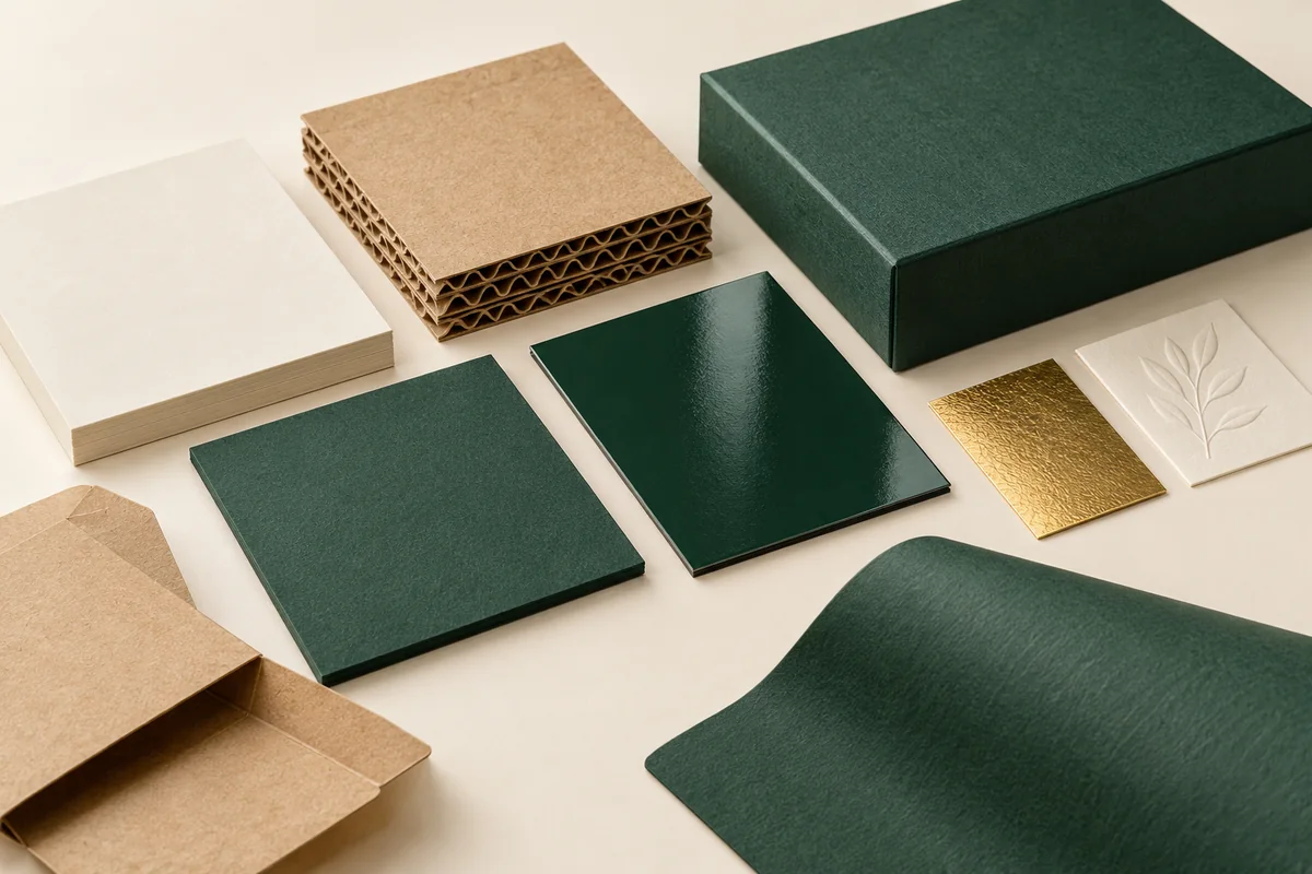
This packaging materials and finishes guide separates the board that supports your product from the surface treatment that changes its appearance and feel. Compare the practical trade-offs, artwork requirements and sample checks before specifying your custom boxes.
Match the board to product weight, box structure and handling conditions. Choose finishes for a clear purpose, such as reducing glare or emphasizing a logo, and review them on the intended material. Names alone do not establish strength, recyclability or final print appearance.
Start with the structural material
Corrugated cardboard combines liner layers with a fluted center. Flute profile, liner selection and board construction affect the result. It is commonly considered for shipping cartons and mailers, but the grade must be specified for the actual application. FEFCO describes how different corrugated profiles create different properties.
Kraft paper-based packaging gives a natural paper appearance, but “kraft” does not identify every detail of the box. Ask whether it describes the liner, the paperboard or the covering. Color and texture can influence print contrast, especially with pale colors or small lettering.
Rigid chipboard provides a substantial core for presentation boxes. Its wrap contributes to the finished look. Cardstock and SBS board can provide a smooth surface for many folding cartons. Suitability depends on caliper, stiffness, construction and product requirements, rather than a category name alone.
| Material family | Common starting use | Important specification |
|---|---|---|
| Corrugated board | Mailers and shipping cartons | Flute, grade, liners and packed load |
| Kraft paper or board | Natural-looking cartons and wraps | Exact construction, shade and print contrast |
| Rigid chipboard | Gift and presentation boxes | Core, wrap, opening format and insert |
| Cardstock / SBS | Retail folding cartons | Caliper, stiffness and artwork requirements |
Matte and glossy lamination
Matte lamination creates a lower-glare surface that can support a restrained visual style. It does not necessarily make a dark box immune to fingerprints or rubbing. Compare samples under normal lighting and ask about the particular film and surface behavior.
Glossy lamination creates a more reflective appearance. It can suit vivid artwork, but glare may compete with small text or detailed photography. A finish can also change how a color is perceived. Review color and finish together rather than approving them independently on a screen.
Spot UV, foil and dimensional detail
Spot UV applies a selected surface effect to specific artwork areas. It can create contrast between a matte background and a highlighted pattern. Placement, registration and minimum detail need to be agreed with the production team. A large reflective area will read differently from a fine accent.
Foil stamping can emphasize a logo or border with a metallic or other specified foil. The effect depends on the substrate, foil, tooling and artwork. Very fine lines and crowded lettering may need adjustment. Embossing and debossing create raised or recessed detail. These effects depend on the material and construction, and they should be checked where folds or wrapped edges are nearby.
| Finish | Useful design role | Sample check |
|---|---|---|
| Matte | Quiet surface with reduced glare | Rubbing, fingerprints and dark artwork |
| Gloss | Reflective, vivid presentation | Glare and text readability |
| Spot UV | Selective contrast or pattern | Alignment and detail size |
| Foil | Distinctive logo or accent | Fine lines, coverage and substrate |
| Emboss / deboss | Tactile mark or subtle dimensional detail | Depth, legibility and nearby folds |
Prepare artwork for the actual production method
Ask for an approved dieline and file requirements before finishing artwork. Keep cut, crease and glue information on the required layers. Define separate artwork for special processes when requested, and confirm how colors, overprint and transparency should be handled. Do not send a screenshot as a substitute for a production file.
Extend artwork into the specified bleed area where color runs to an edge. Keep important text within the agreed safe area. Adobe’s bleed guide explains the purpose of extending artwork beyond the trim. The actual bleed, safe area and export preset must follow your packaging supplier’s instructions.
Evaluate the complete pack, including disposal
A paper-based substrate does not make every finished pack equally easy to recycle. Coatings, films, adhesives, inserts and mixed components can change the recovery route. Ask what the complete structure contains and how components can be separated. Check local collection guidance rather than adding a general recycling claim because the box looks like paper.
For appearance, request a sample using the intended board and finish. For function, pack the actual product and check assembly, opening and restraint. A visual mockup is useful for discussion, but it cannot verify either surface performance or transit protection.
Questions to include in your material brief
- What board construction and caliper are proposed?
- What is the exact finish and which panels receive it?
- Which artwork elements need special process layers?
- What sample will demonstrate color and texture?
- How do insert, adhesive and coating choices affect the complete pack?
Compare a board sample and a finished print sample
A packaging materials and finishes guide is most useful when it helps you make a specific approval decision. Compare the same artwork on the proposed board and finish. A kraft surface, white carton and wrapped rigid box can present the same color differently; the screen preview does not reproduce the texture or reflection of a physical sample.
| Choice | Inspect | Ask the supplier |
|---|---|---|
| Matte or gloss | Readability, reflection and handling marks | Which board and coating are included? |
| Foil or spot UV | Alignment, fine detail and contrast | How should the artwork layer be supplied? |
| Embossing or debossing | Legibility and interaction with folds | Which areas of this structure are suitable? |
| Uncoated board | Texture, ink appearance and scuffing | What protection does the intended use require? |
Use the supplier’s approved dieline and file requirements. Bleed, safe areas and separate finish layers have different jobs: artwork extending past a trim edge is not the same as text that must stay away from a cut or fold. Adobe’s print-bleed guide explains the purpose of extending artwork beyond the trim boundary. Do not substitute a general example for the printer’s required measurements.
For a US retail launch, approve the text and artwork version for each SKU before production. Compare packaging material options, matte lamination and foil stamping alongside your structure and budget.
Frequently asked questions
Does thicker board always mean a better box?
No. Structure, stiffness, grade and load distribution matter. Select the board with the product and box design in mind.
Can I combine finishes?
Often, but compatibility, sequence, tooling and cost must be confirmed. A focused combination usually communicates more clearly than treating every panel differently.
Will the screen preview match the printed color?
Not exactly. Screens, ink, substrate and surface reflection differ. Agree an appropriate proof or sample for critical color decisions.
Specify the material and surface together
Browse materials and finishes and share your packaging brief with your preferred appearance and product requirements.