
THE PACKAGING JOURNAL
Packaging & Brand Identity: Build a Consistent Design
Build packaging brand identity with a clear logo, color system and readable artwork. Use a practical checklist to keep your product range consistent.
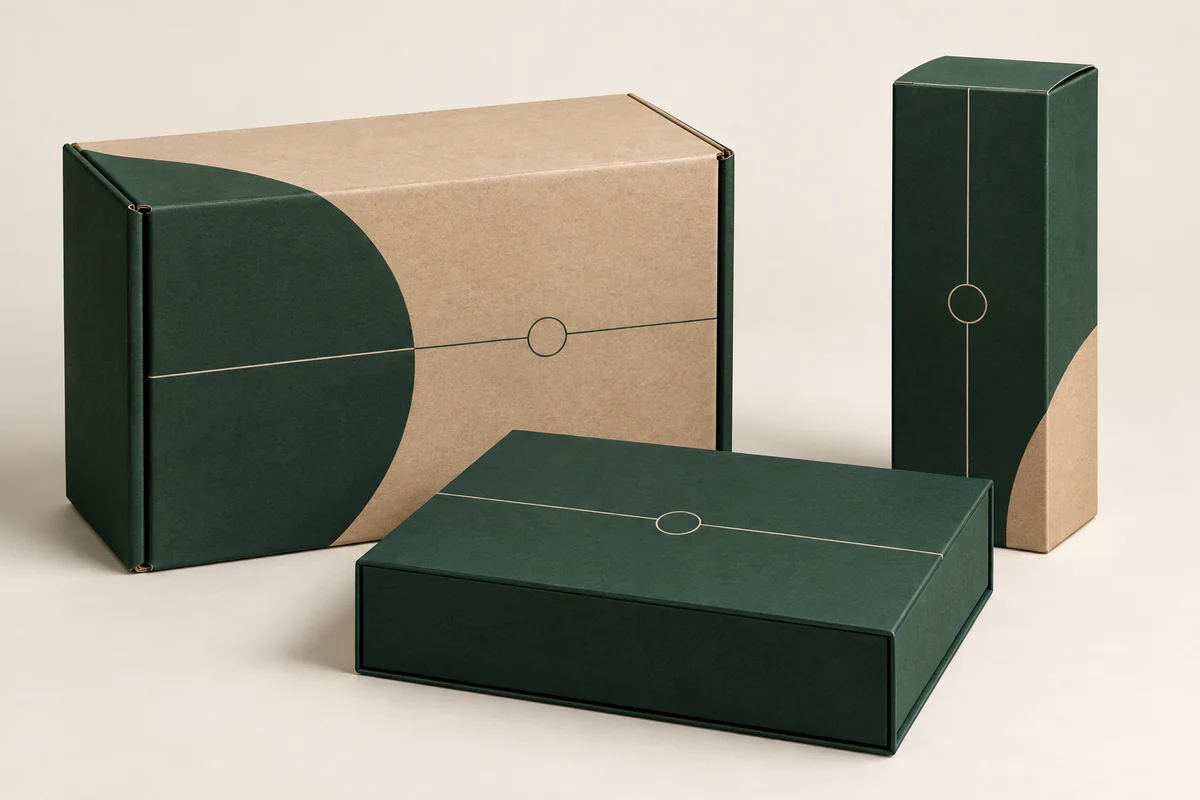
Packaging brand identity connects your logo, color, typography and box structure into a consistent product experience. Use this guide to build a recognizable printed packaging system that works across different SKU sizes, retail formats and delivery packs.
Define a small set of repeatable design rules: logo placement, colors, typography, information hierarchy and the opening sequence. Apply those rules to the actual dieline, then check them on a physical sample and across your product range.
Begin with the brand and the product context
Write a short design brief describing your audience, product and intended impression. “Premium” is too broad on its own. Do you want quiet and understated, colorful and playful, or practical and direct? Include a few visual references and explain which elements are relevant. A reference should clarify the direction rather than encourage an exact copy of another brand’s pack.
Connect the brief to the customer’s situation. A retail carton must communicate in a shelf environment. A delivered mailer may introduce the brand before the product is visible. A gift box may need to feel appropriate when handed directly to the recipient. The same identity can work across these settings, but the hierarchy may change.
Build a clear information hierarchy
Identify what the customer needs to notice first: brand, product name, variant or a key instruction. Give each a deliberate position and enough visual separation. Avoid making every line the same size and weight. Keep essential information readable on the real panel, not only when the artwork is enlarged on a monitor.
Separate primary presentation from supporting information. A front panel might carry the brand and product name, while a side panel holds care details or a useful link. Required product labeling should be reviewed for the actual product and market. Do not remove necessary information just to achieve a cleaner-looking design.
| Element | Rule to define | Consistency check |
|---|---|---|
| Logo | Position, clear space and minimum size | Visible across small and large formats |
| Color | Primary palette and variant accents | Review on the chosen board and finish |
| Typography | Heading, product and supporting text styles | Readable at actual printed size |
| Layout | Information zones and alignment | Works around folds, seams and openings |
| Unboxing | Opening cue, reveal and removal | Intuitive with the actual product |
Use color and typography with production in mind
A brand color may look different on a smooth white carton, textured kraft liner or coated rigid wrap. Screens emit light; printed surfaces reflect it. Share production-ready color information and discuss the appropriate proofing method for critical colors. Do not assume a hex color alone defines a printed result.
Choose typography that remains clear at the intended size. Fine strokes, reversed text and low-contrast combinations deserve special attention on textured materials. Print the artwork at scale for a basic readability check, then review the actual production sample. Keep product variants distinct without introducing a completely new visual language for each one.
Let the structure support the brand
The box format influences how the identity is experienced. A mailer has exterior, lid and interior surfaces that appear at different moments. A sleeve can introduce an extra branding layer around a tray or existing pack. A two-piece box separates the lid presentation from the product reveal.
Place artwork on an approved dieline before judging the composition. A logo centered on a flat layout can end up close to a fold when assembled. Patterns may need deliberate alignment across panels. Reserve glue areas and other production zones as instructed. Adobe’s bleed guidance explains why edge artwork extends beyond trim; the supplier’s dieline requirements determine the exact setup.
Choose materials and finishes that reinforce the idea
A natural kraft surface can support an earthy visual direction, while a smooth ivory board can give fine typography a quieter setting. Matte, gloss, foil and embossing offer different visual and tactile effects. Their value depends on how they support the hierarchy. If every element is highlighted, the focal point can become unclear.
For example, a restrained jewelry pack might use one tactile logo detail and a carefully fitted insert. A bright retail carton may rely on color and a readable product name instead of several special treatments. Compare materials and finishes with the intended construction and project budget.
Design the opening sequence
Think about the pack as a short sequence: how the customer locates the opening, what appears first, and how the product is removed. Keep the process intuitive. A difficult tab or an overly tight insert can undermine an otherwise attractive design. Check the experience with someone who has not seen the prototype before.
An interior message can add warmth, but it should be brief and relevant. Instructions belong where they will be seen when needed. Consider what happens after opening as well: can the box be repacked, stored or separated into components easily? Avoid adding a decorative item unless it has a clear role.
Keep the system consistent across your range
Build a small packaging style sheet that records approved colors, logo rules, type sizes, material references and panel layouts. Note which elements may change for variants. This helps prevent each new product or reorder from drifting into a different identity.
Imagine a skincare brand with a bottle carton, jar carton and gift set. Shared typography and a consistent logo zone can connect the range, while an accent color or clearly printed variant name distinguishes the contents. The structure should still fit each product; consistency does not require identical dimensions.
Before approving branded packaging
- Check logo position and clear space on an assembled sample.
- Review every panel’s text, spelling and product variant.
- Confirm color and finish with the agreed proofing process.
- Test opening, removal and repacking with the real product.
- Save the approved artwork version and final specification.
Build a packaging identity checklist across your SKUs
Packaging brand identity is a repeatable system, not simply a large logo. A skincare carton, a gift set and a shipping mailer can feel related without using identical structures. Define which visual elements stay consistent and which change so customers can identify the product variant without opening the box.
| Element | Keep consistent | Allow to vary |
|---|---|---|
| Logo | Approved artwork and clear space | Scale and panel position for the structure |
| Color | Specified brand references | Controlled variant accents |
| Typography | Hierarchy and readable type choices | Layout for different panel sizes |
| Opening experience | Intentional sequence and tone | Insert and closure appropriate to the product |
For example, a lipstick range may use one logo position and a small variant panel, while a skincare gift set needs space for several product names. Keep the brand recognizable but avoid forcing the same text layout onto both. Review the artwork at actual print size: a screen zoom can hide small type, weak contrast and crowded fold areas.
Send an approved logo file, color references, SKU names and one clearly versioned artwork package. Identify who approves the proof and which design is current. Compare custom boxes with logo printing and custom printed boxes to connect the visual system with a suitable structure. Approve the sample appearance separately from the artwork spelling and placement.
Frequently asked questions
Do I need to print every surface?
No. A focused exterior and one useful interior detail may communicate the identity clearly. Choose surfaces according to their role and visibility.
Should every product use the same box?
No. Keep visual rules consistent while adapting the structure and dimensions to each product.
Can a simple design feel premium?
Yes. Proportion, readable typography, appropriate materials and careful fit can create a strong impression without complex decoration.
Build your packaging identity around the product
Explore custom boxes with a logo and printed packaging. Share your brand assets and product details to start a clear project brief.